
I had some extra time in class, so I did another logo for "Solar Wind". This version is very literal, what with the fan spiraling symbol and the wind through the text. I don't know if I like it any better or worse than the first version. The real idea behind this logo is that the company could use the logo with the text or leave it out, keeping the fan symbol as the image for their company.
1 comment:
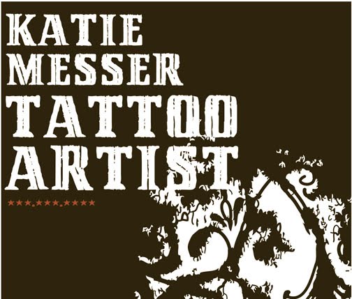
Hi Katie - I love this one! You did such a great job! This one really captures the concept! Yay
*Shannah*
Post a Comment